
Dutch Girl
Kerry had built Dutch Girl from scratch in under a year, and it was taking OFF. But the brand—started in Canva like so many small businesses do—hadn't caught up to where she was headed. She needed something more polished, more intentional and more her.
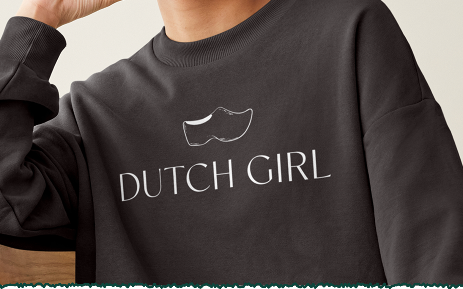
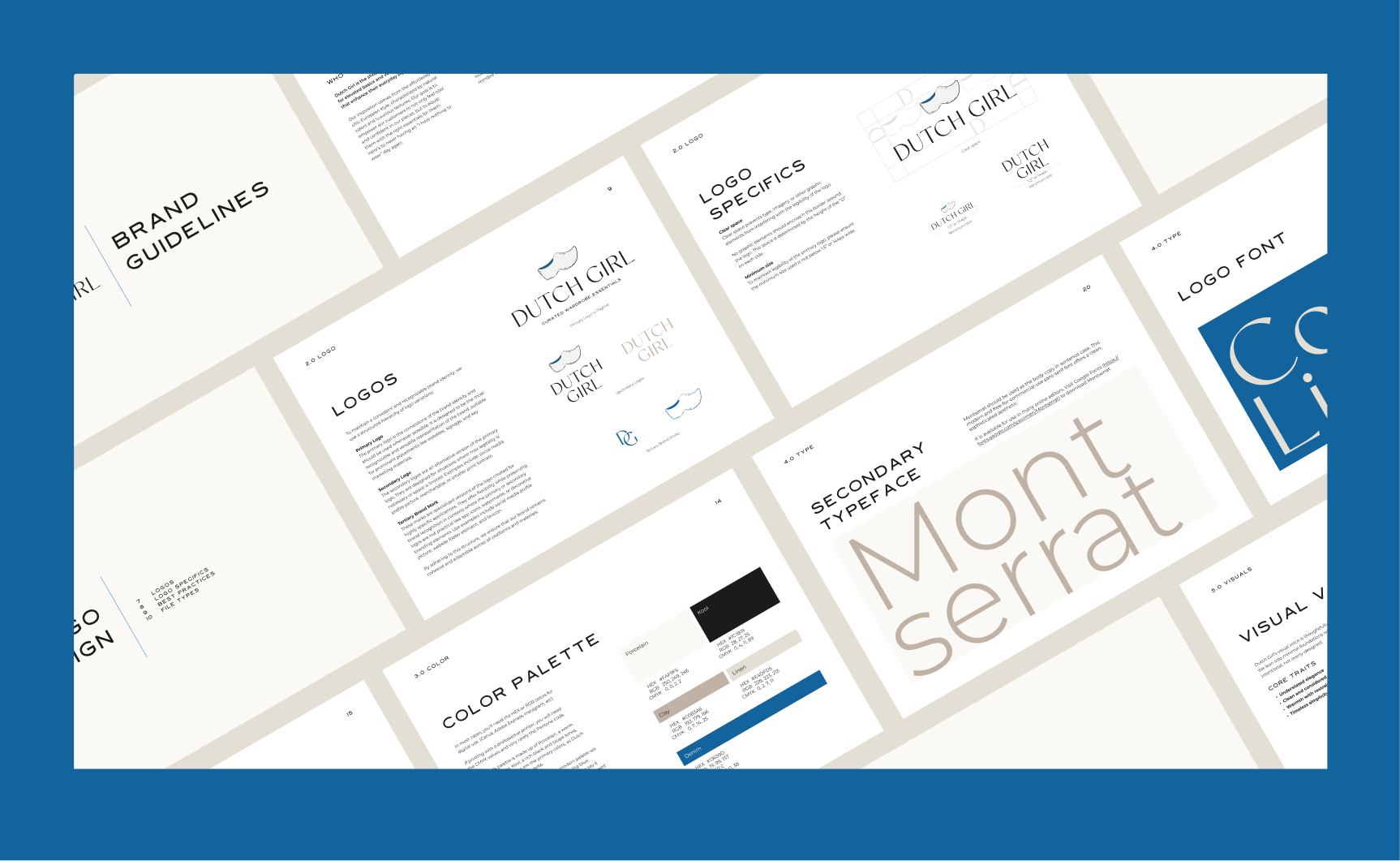
The Dutch clog was central to the brand, so getting the logo illustration right was non-negotiable. I went through close to 100 iterations trying to find the balance between Dutch heritage and the modern, effortless energy Kerry had cultivated. Too literal and it felt costume-y. Too abstract and it lost the nod to where the name came from. Bring two shoes in? Absolutely not. The version we landed on was the one that finally felt like everything at once.
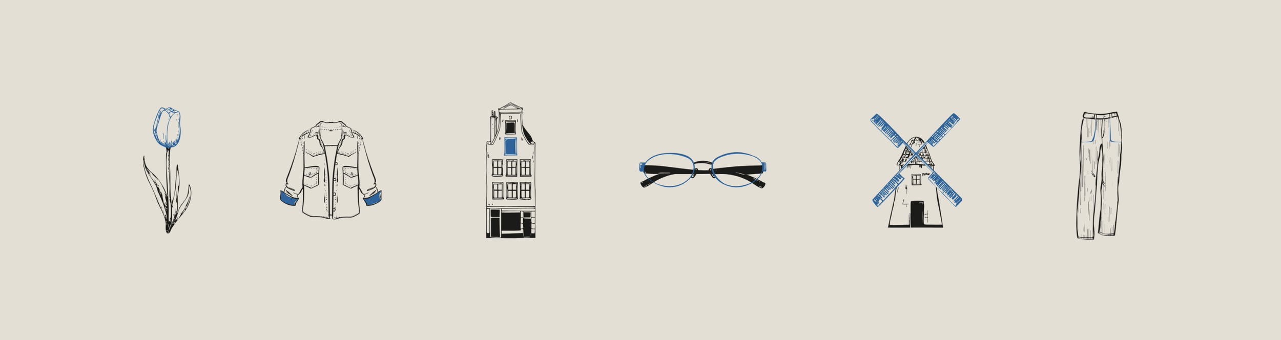
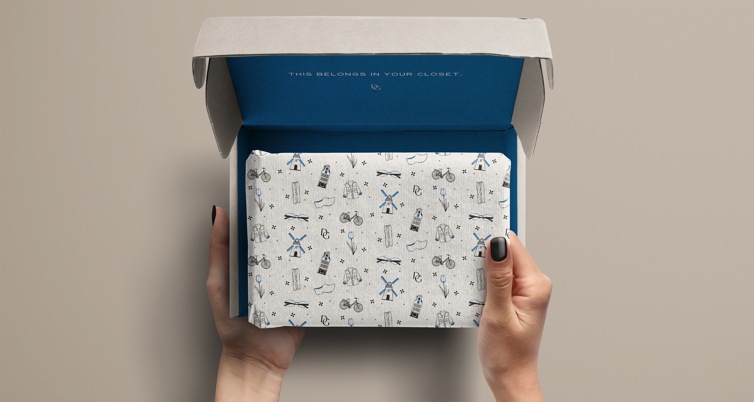
Color was its own puzzle. Kerry had been working almost entirely in tans, creams and black, safe, clean, but not ownable. We knew she needed a signature color, but had to bring her along on the journey. We presented three directions: a warm neutral, a red and a denim blue. The blue won immediately. It's the kind of color that feels effortless without trying, which suited Kerry and Dutch Girl perfectly.

Agency: fivefifteen co.